22…
… this is the count of school shootings which took place in USA within the first 21 weeks in 2018. Statistically this means that there has been more than 1 shooting per week. The Washington Post wrote that this led to more deaths at schools than members of the US military have been killed while being deployed this year.
We hear about those shootings quite often in the news, and after almost every of theses a new discussion about the USA gun laws arises. Nevertheless, I do not want to get into theses discussions here but rather share some of my research with you. I was wondering if I could visualize USA school shootings on a map and decided to create a interactive dashboard to explore the data a little bit further. I found the School Shootings in the United States Wikipedia article which I used as a datasource for my project.
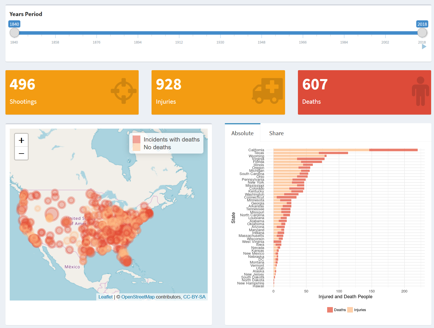
We need to keep in mind that, hidden behind all these data and statistics, there are people. People who died, people who got injuried, people who have been crying for their friends and family members and even more. Feel free to explore the data by your own to get a feeling for all those incidents and victims:
Link to R-Shiny USA School Shootings Dashboard
One word of caution at this point: We cannot be sure that the article has documented every single shooting, but the Wikipedia community is working hard to keep the records up-to-date and adds new entries really quickly. Nevertheless, the present dataset does not raise the claim to be complete and to include every incidents ever happened.
The code for the dashboard can be found on my GitHub account:
R-Shiny USA School Shootings Dashboard - Code
For those who are interested in the data cleaning and preparation, I will go trough this process step by step in the rest of the blog post.
Environment Setup
In order to read the html tables from the Wikipedia article we are going to use the rvest package. To clean the data we will use the tidyverse package, and to built a interactive map later we are going to use the leaflet package. Further we will need ggmap for geocoding.
if (!require(rvest)) {
  install.packages("rvest")
}
if (!require(ggmap)) {
  devtools::install_github("dkahle/ggmap")
}

if (!require(leaflet)) {
  install.packages("leaflet")
}
library(rvest)
library(tidyverse)
library(ggmap)
library(leaflet)
Load Data from Wikipedia
To extract the data directly from the Wikipedia article we use the rvest package from Hadley Wickham. This package makes it easy to scrape data from html web pages. You can find some further information on its Github page or on this small blogpost from Hadley Wickham.
url <- "https://en.wikipedia.org/wiki/List_of_school_shootings_in_the_United_States"

# Read html and save it to the dashboard data folder for download
articleHTML <- url %>%
  read_html()

write_html(articleHTML,
           "./usa_school_shootings_shiny/data/List_of_school_shootings_in_the_United_States.html")

# Extract tables and save them to a list
table_list <- articleHTML %>%
  html_nodes("table") %>%
  html_table()

# Convert all columns to character to avoid errors because of unclean data when binding rows
dt <- map(table_list, function(x) map(x,as.character)) %>%
  bind_rows()

# Save raw data to dashbaord data folder
saveRDS(dt, "./usa_school_shootings_shiny/data/raw.RDS")

head(dt)
Data Preparation
Data Cleaning
We need to perform some data processing and cleaning steps so that we can use it for our dashboard. This steps include:
- Remove duplicated part of
Date(i.e.000000001764-07-26-0000July 26, 1764) - Remove duplicated
Locationafter “!”-character (i.e.Greencastle, Pennsylvania !Greencastle, Pennsylvania) - Convert
InjuriesandDeathsto integer (characters like “?”, “1+”, will be converted to NA)
dt <- dt %>%
  mutate(
    # If Date contains "-0000" then remove the first part from it (first 24 characters)
    Date = ifelse(str_detect(Date, "-0000"),
                  str_sub(Date, 24),
                  Date),
    # Convert Date to Date type
    Date = parse_date(Date, format = "%B %d, %Y", locale = locale("en")),
    year = as.integer(format(Date, "%Y")),
    century = as.integer(format(Date, "%C")),
    decade = floor(year/10)*10,
    # If Location contains "!", then remove part after that character
    Location = ifelse(str_detect(Location, "!"),
                      str_sub(Location, 1, str_locate(Location, " !")[,1] - 1),
                      Location),
    # Count words in Location for correct State extraction
    words_in_location = str_count(Location, '\\w+'),
    ### Extract State from Location variable ###
    # If City provided (words_in_location > 1), split City and State to only get State
    State = ifelse(words_in_location > 1,
                   str_split_fixed(Location, ",", n = 2)[,2],
                   Location),
    # Trim whitespace and remove "." from abbreviations
    State = gsub("\\.", "", trimws(State)),
    # Correct state abbreviations using the R state.abb and state.name dataset
    State = ifelse(State %in% state.abb,
                   state.name[match(State, state.abb)],
                   State),
    # Convert Deaths and Injuries to integer
    ### End: Extract State from Location variable ###
    Deaths = as.integer(Deaths),
    Injuries = as.integer(Injuries),
    # Create html popup message for later plot
    popup = paste0("<b>Date: ", Date, "</b><br/>",
                   "<b>Deaths: ", Deaths, "</b><br/>",
                   "<b>Injuries: ", Injuries,"</b><br/>",
                   "<br/>",
                   "<b>Description: </b><br/>",
                   Description)
  ) %>%
  select(-words_in_location)

dt
Geocoding
Now that we have cleaned the data, we can convert the Location column to latitude and longitude data for our plot by using the geocode() function from the ggmap package. You’ll find a small introduction in my previous blogpost, where I used the package to geocode the addresses from San Francisco Police Departments.
api_key <- read_lines("./additional_data/api-key.txt") #you would need to insert your api key here
register_google(api_key, account_type = "standard")
# Get location from Google Maps Geocoding API
locations <- geocode(dt$Location, messaging = FALSE)
# add latitude and longitude data to our data frame
dt <- bind_cols(dt, locations)
saveRDS(dt, "./usa_school_shootings_shiny/data/cleaned.RDS")Some plots
Leaflet Map
Having finished the data preprocessing we are going to use the leaflet package to create a interactive map. I also used this package within the Shiny dashboard. Here we will show all incidents in year 2018
leafletColors <- colorFactor(palette = c(Deaths = "#e34a33", Injuries = "#fdbb84"),
                          domain = c("Incidents with deaths", "No deaths"))


leaflet(data = subset(dt, year == "2018")) %>%
  addTiles() %>%
  addCircleMarkers(lng = ~lon,
                         lat = ~lat,
                         popup = ~popup,
                         label = ~Location,
                         color = ifelse(dt$Deaths > 0, "#e34a33",
                                        "#fdbb84"),
                         opacity = 0.3,
                         fillOpacity = 0.3,
                         radius = sqrt(dt$Deaths + dt$Injuries) + 6
        ) %>%
  addLegend(position = "topright",
            pal = leafletColors,
            values = c("Incidents with deaths", "No deaths"))
State Statistics
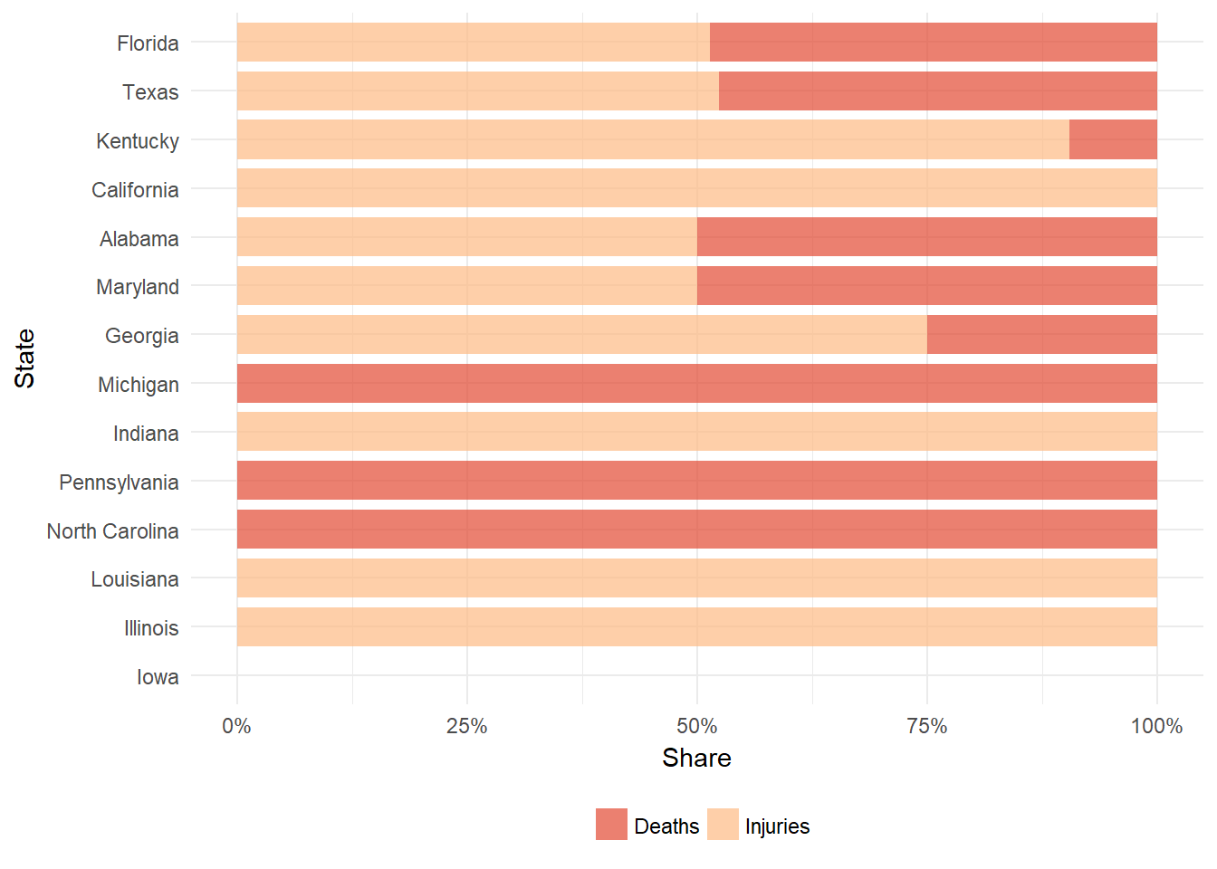
As in the dashboard we are going to plot to summary plots for a absolute count and share of death and injured people per state (here only year 2018 again).
 myFillColors <- c(Deaths = "#e34a33", Injuries = "#fdbb84")

dt %>%
  filter(year == "2018") %>%
  group_by(State) %>%
  summarise(Deaths = sum(Deaths, na.rm = T),
            Injuries = sum(Injuries, na.rm = T),
            Total = sum(Deaths, na.rm = T) + sum(Injuries, na.rm = T)) %>%
  gather(key = category, value = count, Deaths, Injuries) %>%
  ggplot() +
  geom_col(aes(x = reorder(State, Total), y = count, fill = category),
           alpha = 0.7, width = 0.8) +
  scale_fill_manual(values = myFillColors,
                    guide = guide_legend(title = NULL, keywidth = 1, keyheight = 1)) +
  xlab("State") +
  ylab("Injured and Death People") +
  coord_flip() +
  theme_minimal() +
  theme(legend.position = "bottom")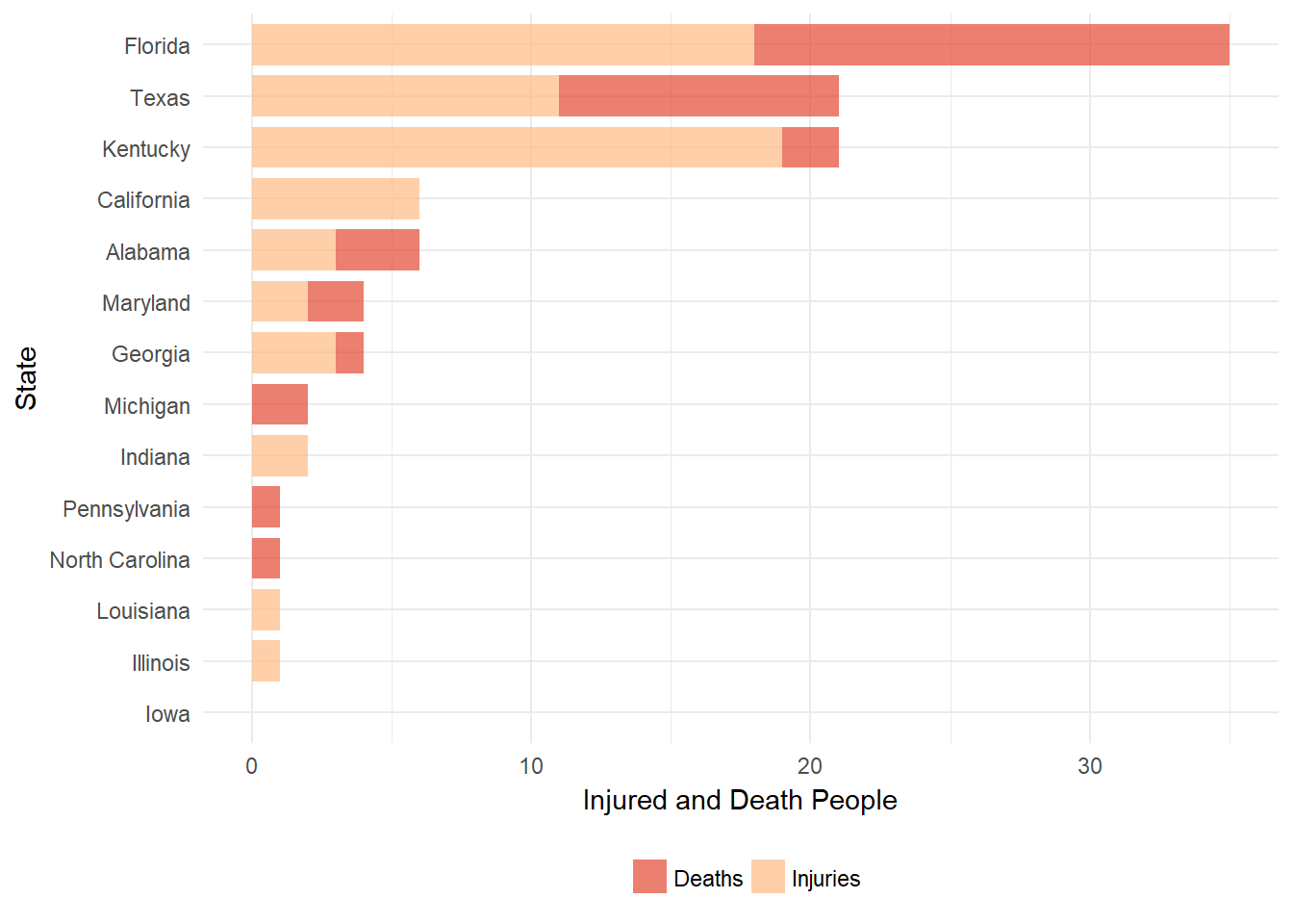
dt %>%
  group_by(State) %>%
  filter(year == "2018") %>%
  summarise(Deaths = sum(Deaths, na.rm = T),
            Injuries = sum(Injuries, na.rm = T),
            Total = sum(Deaths, na.rm = T) + sum(Injuries, na.rm = T)) %>%
  gather(key = category, value = count, Deaths, Injuries) %>%
  ggplot() +
  geom_col(aes(x = reorder(State, Total), y = count, fill = category),
           alpha = 0.7, width = 0.8, position = "fill") +
  scale_fill_manual(values = myFillColors,
                    guide = guide_legend(title = NULL, keywidth = 1, keyheight = 1)) +
  scale_y_continuous(labels = scales::percent) +
  xlab("State") +
  ylab("Share") +
  coord_flip() +
  theme_minimal() +
  theme(legend.position = "bottom")
## Warning: Removed 2 rows containing missing values (geom_col).