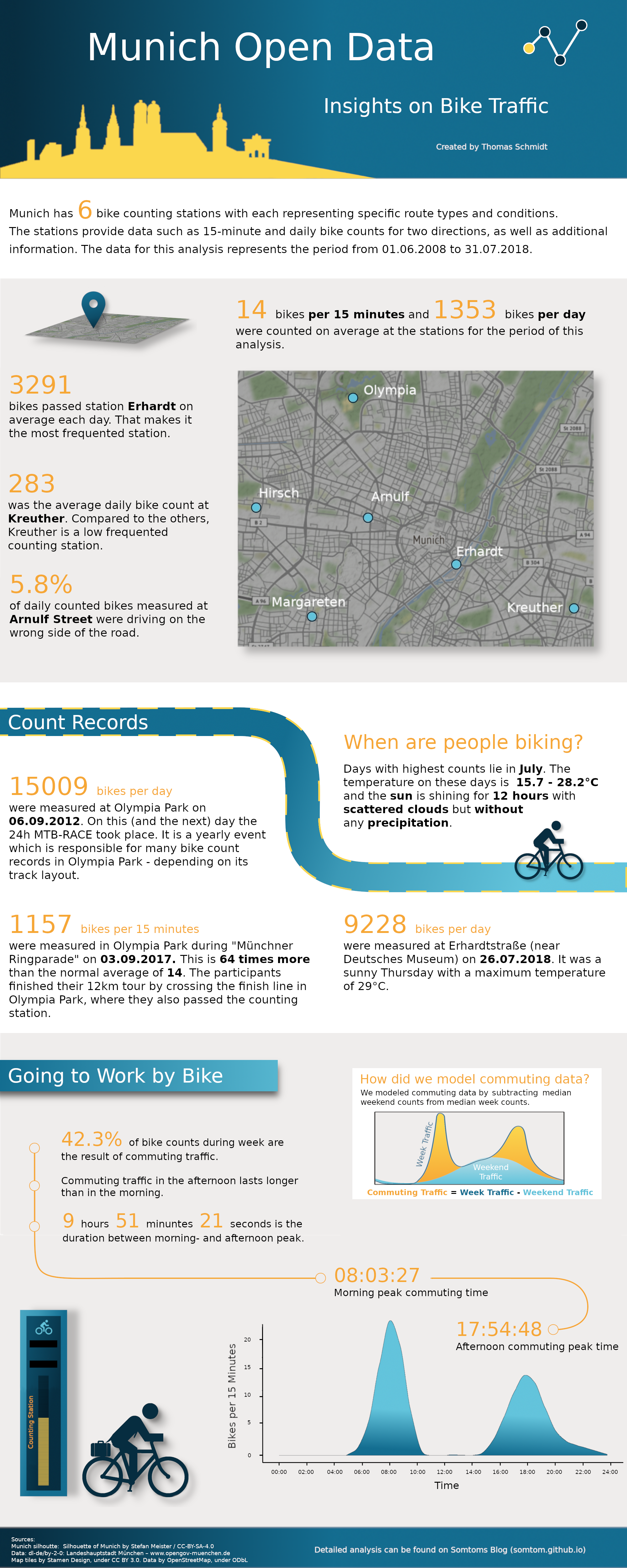
During this year’s summer break there had been a railway construction site which affected the train I usually use for commuting to work. This led to a lot of additional commuting time. Thus, I decided to repair my old mountain bike and give it a try to go to work by bike.
During the one hour ride I wondered how many people made the same decision and if there would be any data about Munich bike traffic with the use of which I could get some insights about Munich’s bike traffic. Shortly after that, I happened to see a twitter post of OpenData Munich which announced a new data set containing the data of Munich’s 6 continuous bike counting stations for the years 2017 and 2018. The counting stations provide data such as 15-minute and daily bike counts for 2 directions.
I contacted the team in order to ask for additional information and received even more data as well as some nice inspirations. I picked up the idea of creating a info-graphic about Munich bike data. Thus, I had a new project and started the journey of designing my first info-graphic.
In this post we will go through the analysis behind the info-graphic you already saw above. We are going to answer questions such as:
- Can we create a map of all counting stations?
- What are average 15 minute and daily counts (across stations and per station)?
- How many people are driving in the wrong direction at Arnulf Street (this station is at a one-way road)?
- What are the highest counts which had been measured?
- When are most people biking (time of the year, weather, …)?
- How does the commuting traffic look like? Can we model it somehow and get some insights out of the data?
If you want to skip the data import and jump directly to the preprocessing step, click here. To directly get into the analysis, click here.
Set up Environment
First, as always, we load some packages needed for this analysis and create a custom theme to make the plots look nicer.
suppressMessages({
  library(tidyverse)
  library(lubridate)
  library(geosphere)
  library(ggmap)
  library(reshape2)
  library(modelr)
  library(broom)
})

background_colors <- c("#efedec", "white")
plot_colors <- c("#62c3db", "#136d8f", "#072d40", "#f6a735", "#fbd74d")
line_colors <- c("black")

# Custom theme
my_theme <- list(
 theme(
    plot.background = element_rect(fill =  background_colors[2]),
    text = element_text(color = line_colors),
    panel.background = element_rect(fill =  background_colors[2]),
    panel.grid.major.y = element_blank(),
    panel.grid.minor = element_blank(),
    panel.grid.major.x = element_blank(),
    panel.grid.minor.x = element_blank(),
    axis.line.y = element_line(color =  line_colors),
    axis.line.x = element_line(color =  line_colors),
    axis.ticks = element_line(color =  line_colors),
    axis.title.y = element_text(margin = margin(t = 0, r = 20, b = 0, l = 0), color = line_colors),
    axis.title.x = element_text(margin = margin(t = 10, r = 0, b = 0, l = 0), color = line_colors),
    legend.position = "bottom",
    plot.margin = unit(c(0.5,1,0.5,0),"cm"),
    strip.background = element_rect(fill = "white", color = "black")
),
  scale_color_manual(
    values = plot_colors,
    guide = guide_legend(direction = "horizontal", label.hjust = 0.5, title.position = "top",
                              title.hjust = 0.5)),
  scale_fill_manual(
    values = plot_colors,
    guide = guide_legend(direction = "horizontal", label.hjust = 0.5, title.position = "top",
                              title.hjust = 0.5)))
Import Data from API
Now, after setting everything up, we need to load the data. Since I got some additional data in .csv format, the importing happens in two steps:
- We import the data from 2017 and 2018 via the Munich Open Data API
- We import the additional data from
.csvformat
Helper Functions
To fetch the data via API, I wrote some helper functions. This functions will also help us with the preprocessing later. The functions can be found in the Github project.
(1) Fetch Data from API
The following chunks will import the data for the years 2017 and 2018 (until end of July):
# Import muc_opd helper functions
# source("./muc-opd-helper-functions.R")

bike_counter_resource_id <- "211e882d-fadd-468a-bf8a-0014ae65a393"
resource_ids <- muc_odp_fetch_bike_count_resource_ids()

resource_ids_15_min <- resource_ids$ids_15_min

resource_ids_daily <- resource_ids$ids_daily
bike_counter <- muc_odp_fetch_data(resource_id = bike_counter_resource_id, destination = "./data/")
bike_cnt_15_min <- bind_rows(
lapply(resource_ids_15_min$resource_id, function(x) muc_odp_fetch_data(resource_id = x,
destination = "./data/15_min/"))
)
bike_cnt_day <- bind_rows(
lapply(resource_ids_daily$resource_id, function(x) muc_odp_fetch_data(resource_id = x,
destination = "./data/daily/"))
)(2) Add Additional Data
Now we import the additional data from the .csv files:
files <- list.files("./data/additional/", full.names = TRUE, recursive = TRUE)
files_15_min <- stringr::str_detect(files, "15Min")

suppressMessages({
  additional_15_min_data <- bind_rows(lapply(files[files_15_min],
                                           read_csv2,
                                           col_types = cols(.default = "c")))
additional_daily_data <- bind_rows(lapply(files[!files_15_min],
                                          read_csv2,
                                           col_types = cols(.default = "c")))
})


# Change date column name to be equal to the API data
names(additional_15_min_data)[1] <- "datum"
names(additional_daily_data)[1] <- "datum"

bike_cnt_day <- bind_rows(additional_daily_data, bike_cnt_day)
bike_cnt_15_min <- bind_rows(additional_15_min_data, bike_cnt_15_min)
Preprocessing
To prepare the data for the analysis we perform the following steps:
- Convert data types (i.e.
charactertoPOSIXctfor dates) - Gather the direction columns (
richtung_1andrichtung_2) into onedirectioncolumn and convert their names to'into center'or'out of center'according to their direction relatively to the city center
- Extract
weekdayinformation and addweekendindicator column - Remove duplicates (caused by the additional data)
(1) Convert Types
After importing the data, we need to convert its datatypes to a format which we can work with. We use the predefined helper functions for that.
bike_counter <- muc_odp_convert_bike_counter_types(bike_counter)
bike_cnt_15_min <- muc_odp_convert_bike_cnt_15_min_types(bike_cnt_15_min)
bike_cnt_day <- muc_odp_convert_bike_cnt_day_types(bike_cnt_day)
(2) Add Directions Information
All tables have two columns which are named richtung_1 and richtung_2. These stand for the two different directions for which the stations measure the counts. In the bike_counter table we can find a description which tells us whether the given direction for that station is east, weast, north or south. We are going to convert the directions to either into center or out of center in order to gain more detailed information. In another helper function I precoded this information with a mapping function.
bike_cnt_15_min <- muc_odp_add_direction_info(bike_cnt_15_min)
bike_cnt_day <- muc_odp_add_direction_info(bike_cnt_day)
bike_counter <- muc_odp_add_direction_info(bike_counter)
(3) Extract Time from uhrzeit_start (English: Time Start) and Add Weekend Indicator Column
In our last preprocessing step we add a time column to the 15 minutes table. This will hold the information on the time of the day. Further, we add the weekday as well as a indicator column which tells us whether the data were measured at the weekend or during the week.
weekend_days <- c("Sat", "Sun")
bike_cnt_15_min <- bike_cnt_15_min %>%
  mutate(time = as.numeric(uhrzeit_start - trunc(uhrzeit_start, "days")),
         weekday = wday(uhrzeit_start, label = TRUE, local = "us"),
         weekend = factor(weekday %in% weekend_days))

bike_cnt_day <- bike_cnt_day %>%
  mutate(weekday = factor(wday(datum, label = TRUE, local = "us")),
         weekend = factor(weekday %in% weekend_days))

class(bike_cnt_15_min$time) <- "POSIXct"
(4) Remove Duplicates and Save Converted Data
Finally, we remove the duplicates from our data set and save the converted data.
bike_cnt_15_min <- unique(bike_cnt_15_min)saveRDS(bike_counter, "./2018-11-03-munich-bike-data-info-graphic_files/bike_counter_converted.RDS")
saveRDS(bike_cnt_15_min, "./2018-11-03-munich-bike-data-info-graphic_files/bike_cnt_15_min_converted.RDS")
saveRDS(bike_cnt_day, "./2018-11-03-munich-bike-data-info-graphic_files/bike_cnt_day_converted.RDS")Analysis
Now that we are done with preprocessing, we can start with our analysis.
Time Period of Our Data Set
First, lets have a look at the time period we are analyzing:
cat(paste0(
  '## 15 Minute Data ##',
  '\nStart:\t', min(bike_cnt_15_min$datum),
  '\nEnd:\t', max(bike_cnt_15_min$datum),
  '\n\n## Daily Data ##',
  '\nStart:\t', min(bike_cnt_day$datum),
  '\nEnd:\t', max(bike_cnt_day$datum)))
## ## 15 Minute Data ##
## Start: 2008-06-01
## End: 2018-07-31
##
## ## Daily Data ##
## Start: 2008-06-01
## End: 2018-07-31Missing Data
Very important for every analysis is to be aware of missing data. So let’s have a look at our data:
bike_cnt_day %>%
  map(function(x) sum(is.na(x))) %>%
  bind_cols %>%
  melt(value.name = "na_count", variable.name = "column") %>%
filter(na_count > 0) %>% knitr::kable(digits = 2)| column | na_count |
|---|---|
| bewoelkung | 25308 |
| sonnenstunden | 25308 |
| niederschlag | 25308 |
| max_temp | 25308 |
| min_temp | 25308 |
| id | 37512 |
We see that some weather data and ids are missing for the bike_cnt_day table. These missing values are all from our additional data. Important is that we need to take this into account when we draw conclusions later.
bike_cnt_15_min %>%
  map(function(x) sum(is.na(x))) %>%
  bind_cols %>%
  melt(value.name = "na_count", variable.name = "column") %>%
  filter(na_count > 0) %>% dim()
## [1] 0 2No data are missing for bike_cnt_15_min table.
Map of Stations
To get a first overview of the locations of the 6 counting stations, we create a map of Munich using the ggmap package and add markers for each station.
area <- make_bbox(lon = longitude, lat = latitude, data = bike_counter)
area <- area + c(-0.02, -0.01, 0.01, 0.01)

suppressMessages({area_map <- get_map(area,  source = "stamen")})

ggmap(area_map, extend = "device", darken = 0.3,
      base_layer = ggplot(aes(x = longitude, y = latitude), data = bike_counter)) +
  geom_point(shape = 21, size = 4, fill = plot_colors[1]) +
  geom_text(aes(label = zaehlstelle), vjust = -1, color = "white") +
  theme_void()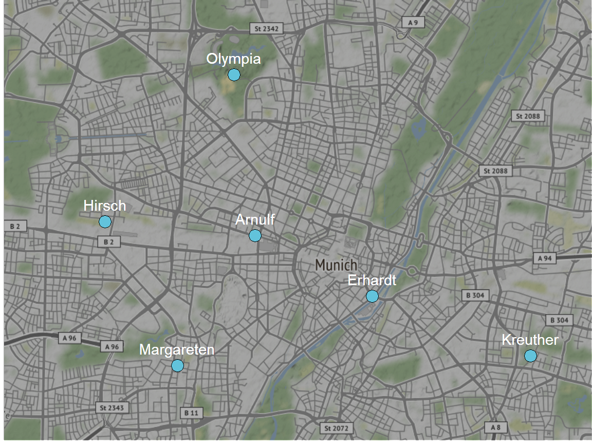
The stations are spread across Munich. Their locations were planned to be as different as possible but also representative for typical traffic situations (Zorn et. al 2011).
Compare the Data of All Stations
What Are Average 15 Minute and Daily Counts?
Now that we have a bird’s eye view on the locations, let’s get an overview on the data by looking at summary stats like average, median and others. First, we start with a summary across all stations. For this purpose we use the summary() function combined with tidy() from the broom package to get everything in one table.
bind_rows(
  c(
    table = "bike_cnt_day",
    broom::tidy(summary(bike_cnt_day$gesamt)),
    sd = sd(bike_cnt_day$gesamt)),
  c(
    table = "bike_cnt_15_min",
    broom::tidy(summary(bike_cnt_15_min$gesamt)),
sd = sd(bike_cnt_15_min$gesamt))) %>% knitr::kable(digits = 2)| table | minimum | q1 | median | mean | q3 | maximum | sd |
|---|---|---|---|---|---|---|---|
| bike_cnt_day | 0 | 305 | 862 | 1352.91 | 1916 | 15009 | 1471.79 |
| bike_cnt_15_min | -2 | 0 | 4 | 13.86 | 17 | 1157 | 23.43 |
On average the stations count 14 bike per 15 minutes and 1353 bikes per day. When we have a look at the maxima, we see that they are quiet high compared to the means. Especially the 15 minute count maximum is 83 times as high as the mean. We might find some interesting events being represented by these high counts but we will dive deeper into that later.
How does the summary data differ if we calculate it per station? We first start with the 15 minute data. To compare the stations we additionally calculate a scaled_median_count which is the median for a single station divided by the minimum of all station medians.
station_summary_15_min <- bike_cnt_15_min %>%
  spread(key = direction, value = count) %>%
  group_by(zaehlstelle) %>%
  summarise(avg = round(mean(gesamt, na.rm = T)),
            median_count = median(gesamt, na.rm = T),
            q1 = quantile(gesamt, 0.25, na.rm = T),
            q3 = quantile(gesamt, 0.75, na.rm = T),
            sd = sd(gesamt, na.rm = T),
            percent_sd = round(sd/median_count * 100, 2)) %>%
  ungroup() %>%
  mutate(scaled_median_count = round(median_count / min(median_count))) %>%
  arrange(desc(median_count))

station_summary_15_min %>% knitr::kable(digits = 2)| zaehlstelle | avg | median_count | q1 | q3 | sd | percent_sd | scaled_median_count |
|---|---|---|---|---|---|---|---|
| Erhardt | 34 | 19 | 5 | 50 | 40.17 | 211.42 | 19 |
| Margareten | 25 | 15 | 3 | 39 | 26.98 | 179.87 | 15 |
| Arnulf | 11 | 6 | 1 | 16 | 14.39 | 239.76 | 6 |
| Olympia | 14 | 5 | 0 | 20 | 20.61 | 412.13 | 5 |
| Hirsch | 6 | 1 | 0 | 8 | 10.68 | 1068.43 | 1 |
| Kreuther | 3 | 1 | 0 | 4 | 4.82 | 482.46 | 1 |
As we see, Erhardt is the station with the highest median 15 minute count (19 bikes). Its median is 19 times higher than the one of Kreuther. Nevertheless, the standard deviation is very high across all stations, which is an indicator for a lot of intra day deviation.
How does the per station summary look like for the daily counts?
station_summary_day <- bike_cnt_day %>%
  spread(key = direction, value = count) %>%
  group_by(zaehlstelle) %>%
  summarise(avg = round(mean(gesamt)),
            median_count = median(gesamt),
            q1 = quantile(gesamt, 0.25),
            q3 = quantile(gesamt, 0.75),
            sd = sd(gesamt),
            percent_sd = round(sd/median_count * 100,2)) %>%
  ungroup() %>%
  mutate(scaled_median_count = round(median_count / min(median_count))) %>%
  arrange(desc(median_count))

station_summary_day %>% knitr::kable(digits = 2)| zaehlstelle | avg | median_count | q1 | q3 | sd | percent_sd | scaled_median_count |
|---|---|---|---|---|---|---|---|
| Erhardt | 3291 | 2862.0 | 1646.00 | 4725.00 | 2080.50 | 72.69 | 13 |
| Margareten | 2385 | 2322.0 | 1340.00 | 3277.00 | 1307.51 | 56.31 | 10 |
| Olympia | 1332 | 1156.0 | 543.50 | 1891.00 | 1077.79 | 93.23 | 5 |
| Arnulf | 1050 | 896.5 | 474.25 | 1412.75 | 792.05 | 88.35 | 4 |
| Hirsch | 615 | 488.5 | 141.25 | 903.75 | 590.32 | 120.84 | 2 |
| Kreuther | 283 | 223.0 | 89.00 | 400.00 | 252.36 | 113.17 | 1 |
We see a similar picture compared to the 15 minute data. With a median daily bike count of 2862, station Erhardt has the highest daily counts, too. This time the count is 13 higher than the count of Kreuther.
How Many People Are Riding in the Wrong Direction at Arnulf Street?
Station Arnulf Street has a special characteristic: The counter is located on a one way bicycle lane. Thus, normally it should only measure counts for one direction, which is into city center.
Luckily it is also able to count all bikers who ride into the wrong direction, which we can use for our analysis. So let’s find out which share of the total counts is due to bikers riding the wrong direction.
wrong_way_drivers <- bike_cnt_day %>%
  filter(zaehlstelle == "Arnulf") %>%
  filter(direction == "out of center") %>%
  mutate(share = round(count / gesamt * 100, 2)) %>%
  select(share) %>% unlist() %>% summary() %>% tidy()
wrong_way_drivers %>% knitr::kable(digits = 2)| minimum | q1 | median | mean | q3 | maximum | na |
|---|---|---|---|---|---|---|
| 0 | 3.91 | 5.1 | 5.8 | 6.68 | 100 | 101 |
The data suggests that on average 5.8 percent of daily counted bikes at Arnulf Street were driving on the wrong side of the road. Interestingly, there must have been at least one day where all bikes were riding on the wrong side of the road since we observed a maximum of 100%.
Count Records
Now it is time to come back to the maximum counts we recognized earlier. To get a quick overview before we dive into the story behind some maximum counts, let’s create a top 10 list for both the daily and the 15 minute counts:
# Daily Counts
top_10_day <- bike_cnt_day %>%
  spread(key = direction, value = count) %>%
  arrange(desc(gesamt)) %>%
  head(10)

top_10_day %>%
  select(datum, gesamt, zaehlstelle) %>%
knitr::kable(digits = 2)| datum | gesamt | zaehlstelle |
|---|---|---|
| 2012-06-09 | 15009 | Olympia |
| 2010-06-26 | 14714 | Olympia |
| 2010-06-27 | 12241 | Olympia |
| 2013-06-19 | 9296 | Erhardt |
| 2018-07-26 | 9228 | Erhardt |
| 2017-07-05 | 9207 | Erhardt |
| 2018-07-24 | 9179 | Erhardt |
| 2016-06-23 | 9113 | Erhardt |
| 2016-07-20 | 9106 | Erhardt |
| 2018-06-20 | 9106 | Erhardt |
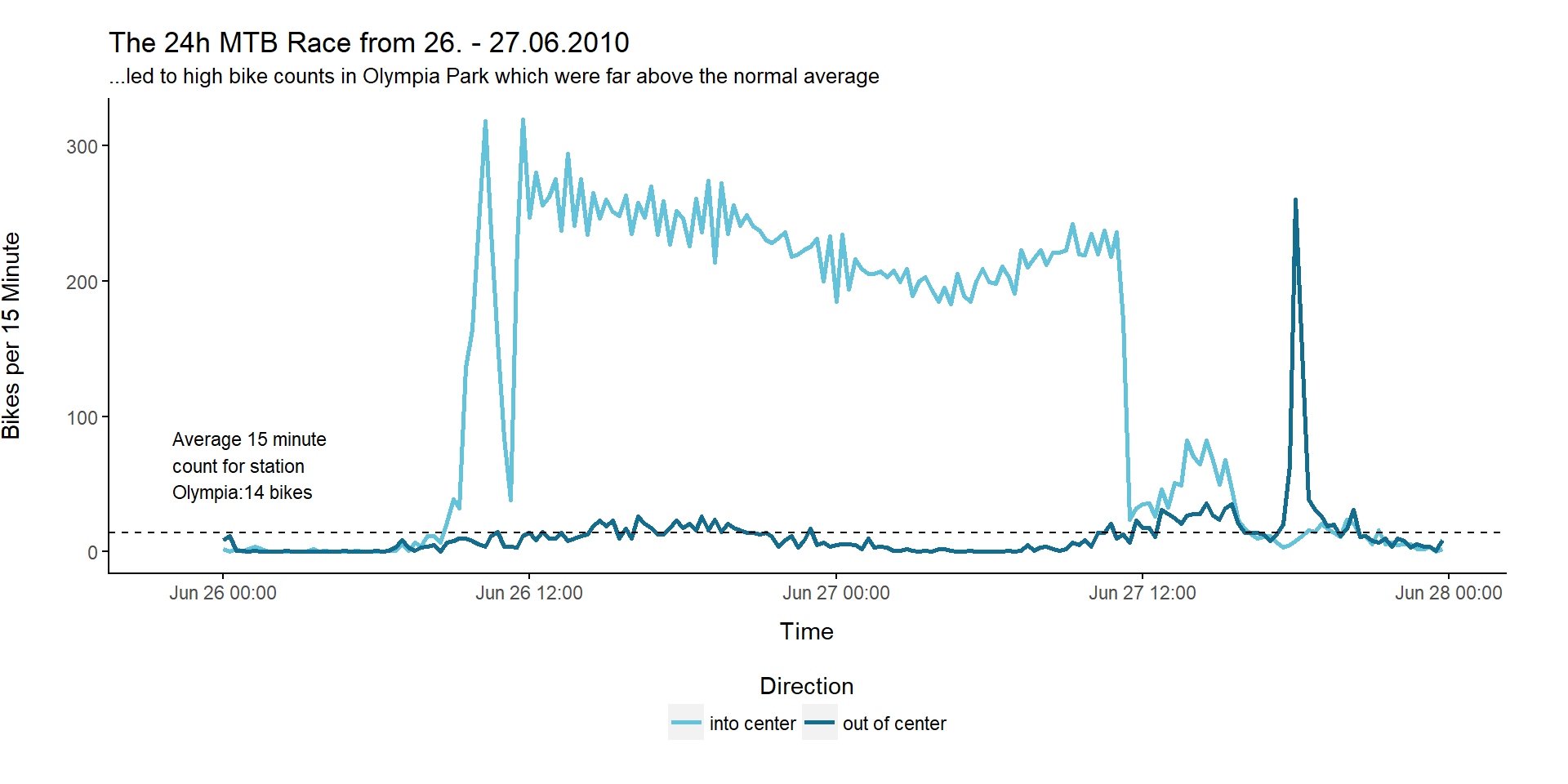
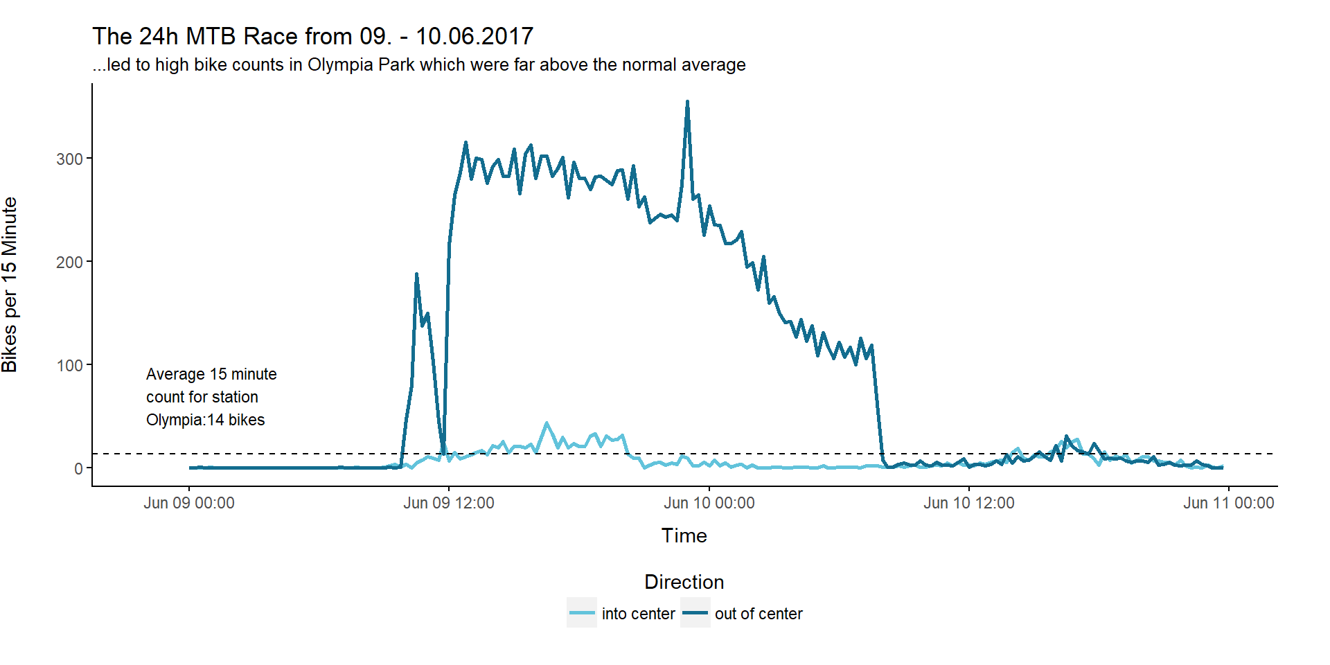
That is interesting: Station Olympia takes the top 3 places with counts above 10 thousand, although it only made the third place when we calculated the median counts per station earlier. After some research I found out that these top 3 counts were caused by the same event, namely the 24h Mountainbike Race, which takes place in Olympia Park every year. Since the route is changed from year to year, the counting station is not always on the track. Thus, we don’t see these record counts every year.
Let’s plot the 15 minute data for the events in the two years in which we observed these high counts:
Now we also create a top 10 list for the 15 minute counts:
# 15 Minute Counts
top_10_15_min <- bike_cnt_15_min %>%
  spread(key = direction, value = count) %>%
  arrange(desc(gesamt)) %>%
  head(10)

top_10_15_min  %>%
select(datum, gesamt, uhrzeit_start, zaehlstelle) %>% knitr::kable(digits = 2)| datum | gesamt | uhrzeit_start | zaehlstelle |
|---|---|---|---|
| 2017-09-03 | 1157 | 2017-09-03 13:45:00 | Olympia |
| 2017-09-03 | 945 | 2017-09-03 14:00:00 | Olympia |
| 2015-05-10 | 540 | 2015-05-10 12:30:00 | Olympia |
| 2015-05-10 | 503 | 2015-05-10 12:15:00 | Olympia |
| 2015-05-10 | 455 | 2015-05-10 12:45:00 | Olympia |
| 2016-10-16 | 421 | 2016-10-16 13:45:00 | Olympia |
| 2016-10-16 | 409 | 2016-10-16 14:00:00 | Olympia |
| 2015-05-10 | 385 | 2015-05-10 12:00:00 | Olympia |
| 2012-06-09 | 365 | 2012-06-09 23:00:00 | Olympia |
| 2015-05-10 | 363 | 2015-05-10 14:45:00 | Olympia |
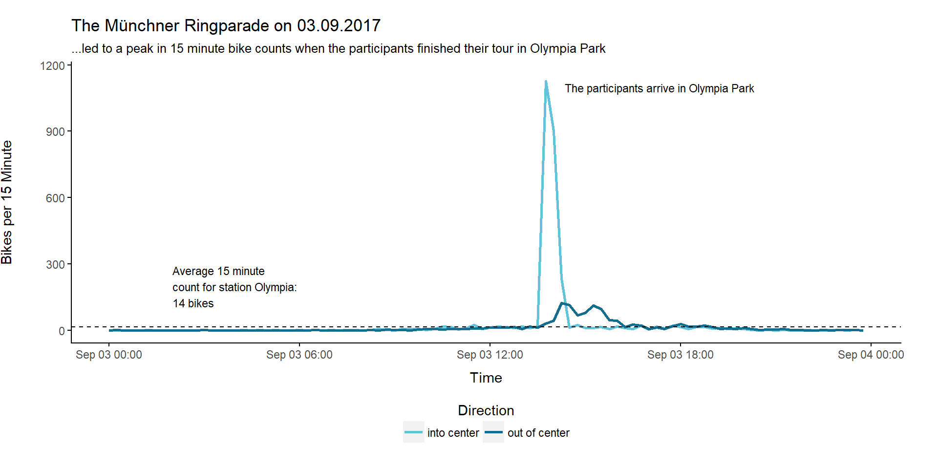
If we have a closer look, we only can find one of our daily count top 10 candidates in this list, namely the 2017-06-09 on the 6th place. Normally you would suppose the date with highest 15 minute counts to also be listed in the daily count top 10 unless the high counts were due to a short time event. So what happened on the 3rd September 2017 when a 15 minute bike count of 1157 was recorded?
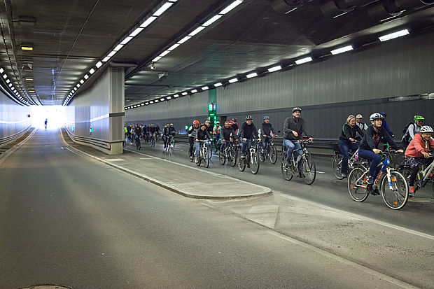
This picture from radlhaupstadt.muenchen.de gives you a hint:
Picture source: radlhauptstadt.muenchen.de
On that day the so called Münchner Ringparade took place. At this event the Munich beltway had been closed temporarily for car traffic while round about 7000 people used this route for a bike tour. The 12 km tour ended in Olympia Park. And this is exactly what we can see in the data:
When Are Most People Biking?
Pattern Across a Year
To answer this question we first try to gain an overview by plotting the development of the daily counts over the years
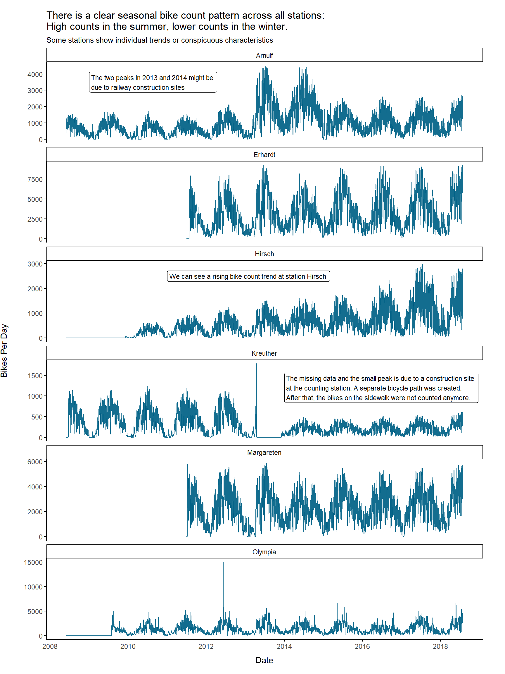
There is definitely a clear seasonal pattern which is similar across all stations. As one would expect, there are higher bike counts during the summer months and lower counts during winter months. However, we also see individual trends or characteristics for some stations:
- Station Hirsch shows a ongoing trend of rising bike counts from year to year
- At Arnulf Street’s counting station one can see two peak years in 2013 and 2014. These peaks could be due to a railway construction site which affected parts of the trains going into city center.
- Station Kreuther showed some high counts at the beginning of 2013 and then no data for the rest of the year. Here the counting station was affected by a construction site when a separate bicycle path was created. After that, bikes on the sidewalk were not counted anymore. This is why daily bike count level dropped afterwards.
- One can clearly see the events taking place in Olympia Park represented by peaks in the data
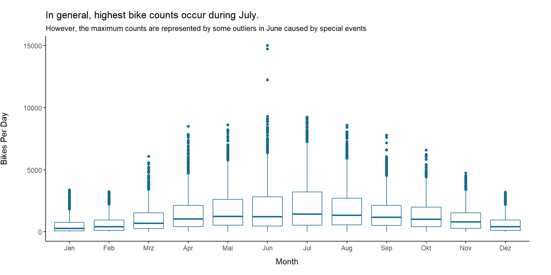
When we plot the bike count distribution for each month, we see that highest median bike counts occur in the month July. However, the maximum counts had been recorded in June. These are due to some of the record events mentioned earlier, though. Thus, they need to be interpreted as outliers
Day of the Week
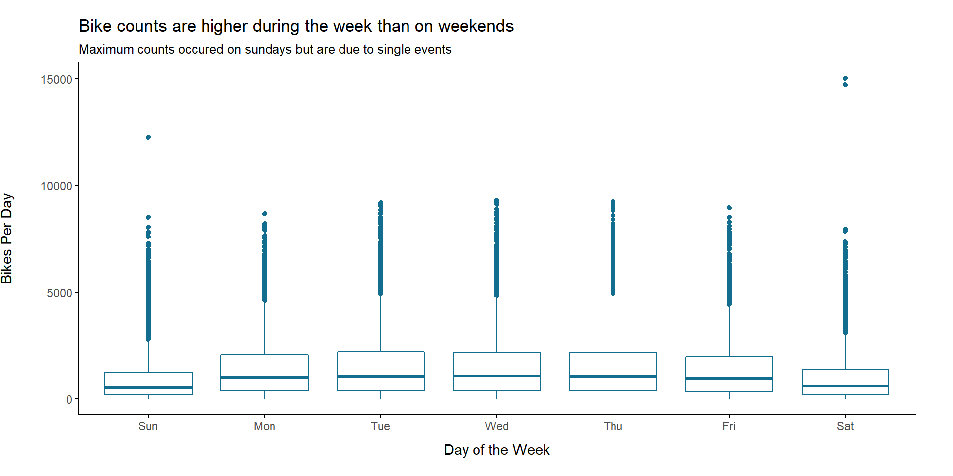
When we look at the distribution of total daily counts, we see that counts during the week are higher than those at the weekends. This is most likely due to commuting traffic, which we will try to model later. The maximum counts occurred on Saturdays but are due to single events like the 24h Mountain-bike race we saw earlier.
Temperature and Weather on Days with Maximum Counts
Now we use the weather data we have (at least for the days where they are not missing) and try to characterize the days with highest bike counts. We look at the distribution of measured values within each weather variable for the month July.
To do so we group the bike counts into 4 categories:
- Lowest 25%: Daily bike counts which lie between the minimum count and the 25% percentile
- Lower Middle: Daily bike counts which lie between the 25% percentile and the median
- Upper Middle: Daily bike counts which lie between the median and the 75% percentile
- Highest 25%: Daily bike counts which lie between the 75% percentile and the maximum
We then will have a closer look into the “Highest 25%” group and the weather parameters measured on these days.
To make the data comparable between stations, we perform the following steps:
- Removing outliers by filtering for bike counts below the 99% percentile for each station
- Scaling the daily counts from each station by dividing the counts by each station’s maximum count
- Using the scaled counts (values between 0 and 1) to assign bike count categories
breaks <- bike_cnt_day %>%
  filter(month(datum) == 7) %>%
  spread(key = direction, value = count) %>%
  group_by(zaehlstelle) %>%
  # Calculate 99% percentile per station in order to filter outlieres
  mutate(percentile_99 = quantile(gesamt, 0.99))  %>%
  filter(gesamt < percentile_99) %>%
  # Scale to make compareable across stations
  mutate(gesamt_scaled = gesamt / max(gesamt)) %>%
  ungroup() %>%
  # Create count classes
  summarise(count_q1 = quantile(gesamt_scaled, 0.25),
         count_q2 = quantile(gesamt_scaled, 0.5),
         count_q3 = quantile(gesamt_scaled, 0.75),
         max_count = max(gesamt_scaled)) %>% unlist()

labels <- c("Lowest 25%\n[0-q1]",
            "Lower Middle\n(q1-q2]",
            "Upper Middle\n(q2-q3]",
            "Highest 25%\n(q3-max]")

bike_cnt_day_july_scaled <- bike_cnt_day %>%
  filter(month(datum) == 7) %>%
  spread(key = direction, value = count) %>%
  group_by(zaehlstelle) %>%
  # Calculate 99% percentile per station in order to filter outlieres
  mutate(percentile_99 = quantile(gesamt, 0.99))  %>%
  filter(gesamt < percentile_99) %>%
  # Scale to make compareable across stations
  mutate(gesamt_scaled = gesamt / max(gesamt)) %>%
  ungroup() %>%
  mutate(cat = cut(gesamt_scaled, breaks = c(0, breaks), include.lowest = T, labels = labels)) %>%
  select(cat, bewoelkung, sonnenstunden, niederschlag, max_temp, min_temp)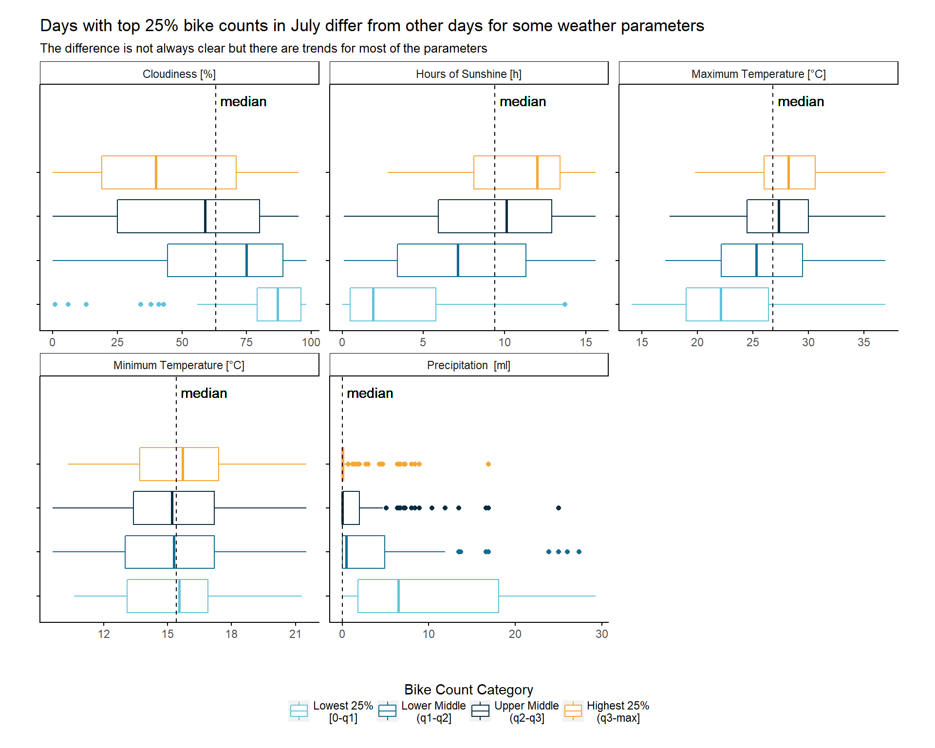
When we look at each weather parameter, we can see differences in value distributions between the 4 bike count categories. However these differences are not always that clear. But, there are at least trends for all parameters except one, namely the minimum temperature, where mostly the variance differs. The other parameters don’t show great surprises: You would, for example, expect the precipitation to be very low on days with a lot of bikes being counted.
In order to get some numbers to describe the days with highest counts, let’s look into a summary for each weather category at days with bike counts within the “Highest 25%” group in July.
get_mode <- function(x) {
  ux <- na.omit(unique(x))
  tab <- tabulate(match(x, ux))
  ux[tab == max(tab)][1]
}

# Characterise the metrics for the maximum category within july
bike_cnt_day_july_scaled %>%
  group_by(cat) %>%
  summarise(max_temp = list(cbind(broom::glance(summary(max_temp)), mode = get_mode(max_temp))),
            min_temp = list(cbind(broom::glance(summary(min_temp)), mode = get_mode(min_temp))),
            bewoelkung = list(cbind(broom::glance(summary(bewoelkung)), mode = get_mode(bewoelkung))),
            sonnenstunden = list(cbind(broom::glance(summary(sonnenstunden)), mode = get_mode(sonnenstunden))),
            niederschlag = list(cbind(broom::glance(summary(niederschlag)), mode = get_mode(niederschlag)))) %>%
  gather(key = metric, value = value, -cat)  %>%
  unnest() %>%
  filter(cat == "Highest 25%\n(q3-max]") %>% mutate(metric = plyr::revalue(metric,
                                c("bewoelkung" = "Cloudiness [%]",
                                  "max_temp" = "Maximum Temperature [°C]",
                                  "min_temp" = "Minimum Temperature [°C]",
                                  "niederschlag" = "Precipitation  [ml]",
                                  "sonnenstunden" = "Hours of Sunshine [h]"))) %>%
select(-na, -cat) %>% knitr::kable(digits = 2)| metric | minimum | q1 | median | mean | q3 | maximum | mode |
|---|---|---|---|---|---|---|---|
| Maximum Temperature [°C] | 19.8 | 26.0 | 28.2 | 28.24 | 30.6 | 36.9 | 28.2 |
| Minimum Temperature [°C] | 10.3 | 13.7 | 15.7 | 15.62 | 17.4 | 21.5 | 17.5 |
| Cloudiness [%] | 0.0 | 19.0 | 40.0 | 43.73 | 71.0 | 95.0 | 75.0 |
| Hours of Sunshine [h] | 2.8 | 8.1 | 12.0 | 10.89 | 13.4 | 15.6 | 14.3 |
| Precipitation [ml] | 0.0 | 0.0 | 0.0 | 1.05 | 0.2 | 16.9 | 0.0 |
Great! We can take these median values for the info-graphic to give a statement for a typical biking day:
Days with highest counts lie in July. The temperature on these days is 15.7 - 28.2°C and the sun is shining for 12 hours with scattered clouds but without any precipitation.
Modeling Commuting Traffic
Differences Between Weekend Counts and Counts During Week
We already got some nice information about the bike traffic in Munich. Our next aim is to use the 15 minute data to model the commuting traffic. We start with a bird’s eye overview by plotting the median 15 minute counts across all stations for weekend and working days.
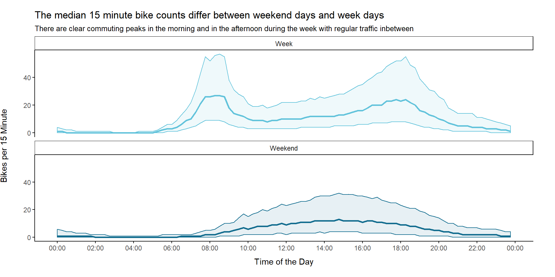
We can see that the 15 minute count patterns clearly differ between weekend days and week days. There are two clear commuting peaks during the week. However, there still seems to be regular traffic between these peaks.
We used the median 15 minute bike count across all stations for the previous plot. But, will we still see the same pattern if we look at each station separately?
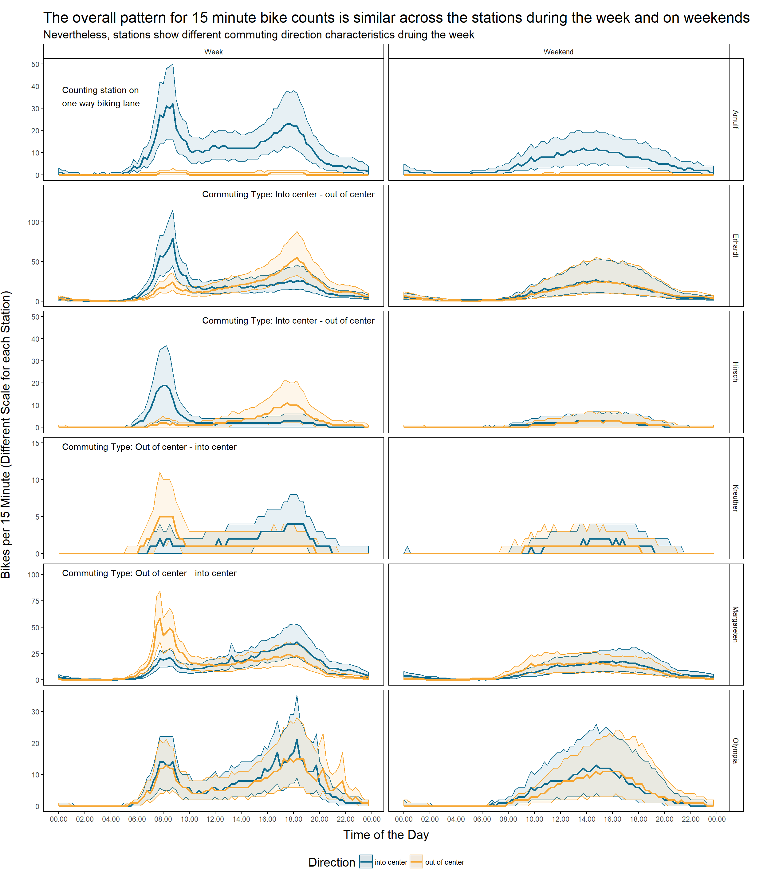
Indeed, the pattern is similar across all stations. Nevertheless, stations show different commuting direction characteristics. The stations can be assigned to either one of these 3 groups:
- Station with traffic mainly in the direction of the city center in the morning and back way in the afternoon:
- Erhardt
- Hirsch
- Stations with traffic mainly out of the city center in the morning and back in the afternoon
- Kreuther
- Margareten
- Stations with similar patterns for traffic into- and out of city center
- Olympia
We cannot really tell for Arnulf Street but it looks like the peaks in the morning and in the afternoon are similar for the only measured direction (into center). This would make it fall into class 3.
The Model
To create a really basic model of the commuting traffic, we make the following assumption: Traffic during week is the result of commuting traffic and the normal traffic which is represented by the weekend data. Under this assumption subtracting the 15 minute weekend counts from the 15 minute counts during the week gives us the commuting part. We are going to create a loess model for each the weekend and the week counts for that purpose.
bike_cnt_15_min_separated <- bike_cnt_15_min %>%
  mutate(Weekend = factor(ifelse(weekend == TRUE, "Weekend", "Week"))) %>%
  group_by(Weekend, time) %>%
  summarise(median = median(gesamt)) %>%
  spread(key = Weekend, value = median) %>%
  mutate(Commuting = Week - Weekend) %>%
  gather(key = week_cat, value = median_count, Commuting, Weekend, Week) %>%
  mutate(week_cat = factor(week_cat, levels = c("Weekend", "Week", "Commuting")),
         commuting_cat = factor(ifelse(week_cat == "Commuting",
                                       "Commuting Traffic",
                                       "Normal Traffic"),
                                levels = c("Normal Traffic", "Commuting Traffic")))

tmp <- bike_cnt_15_min_separated %>%
  mutate(median_count = ifelse(median_count < 0, 0, median_count),
         x = as.numeric(time))

fit_commuting <- loess(median_count~x, data = tmp, subset = c(tmp$week_cat == "Commuting"), span = 0.2)
fit_weekend <- loess(median_count~x, data = tmp, subset = c(tmp$week_cat == "Weekend"), span = 0.2)
fit_week <- loess(median_count~x, data = tmp, subset = c(tmp$week_cat == "Week"), span = 0.2)

bike_cnt_15_min_modeled <- data.frame(x = seq(min(tmp$x), max(tmp$x)), 60) %>%
  add_predictions(fit_commuting, "pred_commuting") %>%
  add_predictions(fit_weekend, var = "pred_weekend") %>%
  add_predictions(fit_week, var = "pred_week") %>%
  # Adjust for 0 values
  mutate(time = as.POSIXct(x, origin = min(tmp$time)),
         afternoon = x > 43200,
         pred_commuting = ifelse(pred_commuting < 0, 0, pred_commuting),
         pred_weekend = ifelse(pred_weekend < 0, 0, pred_weekend),
pred_week = ifelse(pred_week < 0, 0, pred_week)) 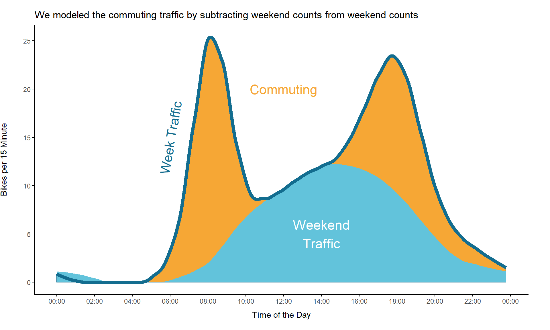
When we use this modeling approach, the predicted commuting traffic would look like this:
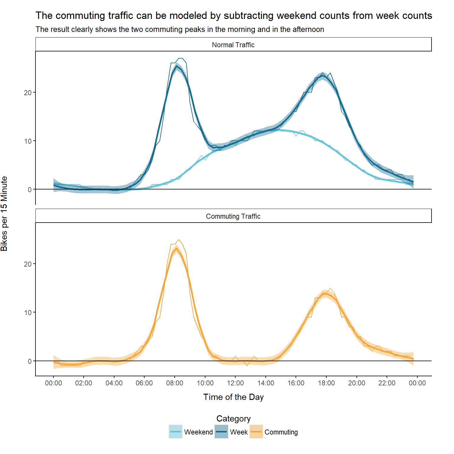
The result looks quiet good. We are able to see the two peaks, one in the morning and another one in the afternoon.
Peak Commuting Times According to Model
Now, that we have a model for commuting traffic, when are the peak times?
morning <- bike_cnt_15_min_modeled %>% filter(!afternoon)
afternoon <- bike_cnt_15_min_modeled %>% filter(afternoon)
# Morning Peak
morning_peak <- lubridate::with_tz(morning[which.max(morning$pred_commuting), ]$time, "UTC")
cat(paste0("Morning peak:\n", format(morning_peak, "%H:%M:%S")))
## Morning peak:
## 08:03:27# Afternoon Peak
afternoon_peak <- lubridate::with_tz(afternoon[which.max(afternoon$pred_commuting), ]$time, "UTC")
cat(paste0("Afternoon peak:\n", format(afternoon_peak, "%H:%M:%S")))## Afternoon peak:
## 17:54:48time_diff <- difftime(afternoon_peak,
morning_peak, units = "hours", tz = "UTC")
hours <- floor((time_diff))
mins <- floor(as.numeric(time_diff - hours, units = "mins"))
secs <- as.numeric(time_diff - hours, units = "secs") - mins * 60
peak_to_peak_duration <- paste0(hours, "h ", mins, "min ", round(secs), "sec")
cat(paste0("Peak to peak duration:\n", peak_to_peak_duration))## Peak to peak duration:
## 9h 51min 21secThe morning peak is around 08:03:27 and the afternoon commuting peak is around 17:54:48. The peak to peak duration is 9h 51min 21sec.
Let’s go on and compare the two peak times a little bit further. When I was looking for a way to characterize the duration of a peak, I found a metric called Full Duration Half Maximum (FDHM). It measures the duration between the points of y axis that are half the maximum amplitude.
We use this method for our data to get a FDHM for both peaks
calculate_FDHM_stats <- function(y, time, period_start, period_end) {
  period_filter <-  time >= period_start & time <= period_end
  y <- subset(y, period_filter)
  time <- subset(time, period_filter)
  max_y <- max(y)

  # Calculate index of intersection points of max_y/2 and y within period
  i <- c(FALSE, diff(max_y/2 > y) != 0)
  times <- time[i]
  y_vals <- y[i]

  list(
    times = times,
    y_vals = y_vals,
    max_y = max_y,
    max_y_x_val = time[which.max(y)],
    fdhm = round(difftime(times[2], times[1], units = "mins"))
  )
}

day_start <- as.POSIXct("1970-01-01 00:00:00")
noon <- as.POSIXct("1970-01-01 12:00:00")
day_end <- as.POSIXct("1970-01-01 23:59:59")

fdhm_stats_morning <- calculate_FDHM_stats(bike_cnt_15_min_modeled$pred_commuting,
                     bike_cnt_15_min_modeled$time,
                     day_start,
                     noon)
fdhm_stats_afternoon <- calculate_FDHM_stats(bike_cnt_15_min_modeled$pred_commuting,
                     bike_cnt_15_min_modeled$time,
                     noon,
                     day_end)

cat(paste0("Morning FDHM: \n", fdhm_stats_morning$fdhm, " Minutes\n"))
## Morning FDHM:
## 140 Minutescat(paste0("Afternoon FDHM: \n", fdhm_stats_afternoon$fdhm, " Minutes\n"))## Afternoon FDHM:
## 197 Minutescat(paste0("Afternoon FDHM is ", fdhm_stats_afternoon$fdhm - fdhm_stats_morning$fdhm,
" Minutes longer"))## Afternoon FDHM is 57 Minutes longerWe create a plot to give a better visual understanding of these metrics:
bike_cnt_15_min_modeled %>%
  ggplot() +
  geom_line(aes(x = time, y = pred_commuting), color = plot_colors[2]) +
  annotate(geom = "ribbon", x = fdhm_stats_morning$times, ymax = Inf, ymin = -Inf, alpha = 0.1,
           fill = plot_colors[2]) +
  annotate(geom = "ribbon", x = fdhm_stats_afternoon$times, ymax = Inf, ymin = -Inf, alpha = 0.1,
           fill = plot_colors[2]) +
  annotate(geom = "text",
           x = fdhm_stats_morning$times[1] - 2*60*60,
           y = max(bike_cnt_15_min_modeled$pred_commuting),
           label = paste0("Morning FDHM:\n", fdhm_stats_morning$fdhm, " Minutes"),
           hjust = 0.5,
           vjust = 1,
           size = 3) +
  annotate(geom = "text",
           x = fdhm_stats_afternoon$times[2] + 2*60*60,
           y = max(bike_cnt_15_min_modeled$pred_commuting),
           label = paste0("Afternoon FDHM:\n", fdhm_stats_afternoon$fdhm, " Minutes"),
           hjust = 0.5,
           vjust = 1,
           size = 3) +
  scale_x_datetime(labels = scales::date_format("%H:%M"), date_breaks = "2 hours") +
  xlab("Time of the Day") +
  ylab("Bikes per 15 Minutes") +
  ggtitle("According to the FDHM* metric the afternoon commuting peak lasts longer than the morning peak",
          "*Full Duration Half Maximum: Duration between points of y axis that are half the maximum amplitude") +
  my_theme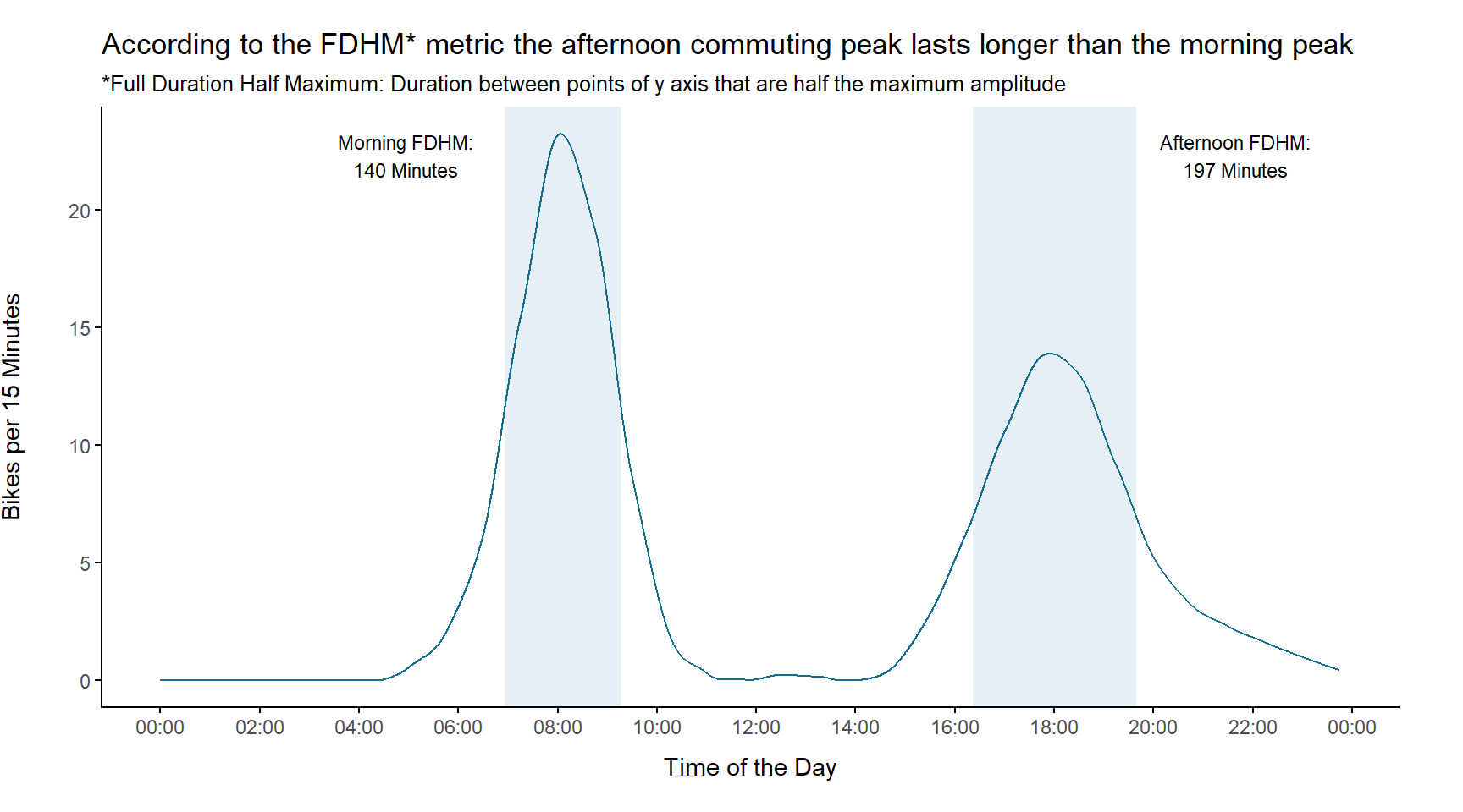
As a last part of the peak analysis we compare the total bike counts within the modeled peaks to see whether those are comparable:
 bike_cnt_15_min %>%
  mutate(weekend = factor(ifelse(weekend == TRUE, "Weekend", "Week"))) %>%
  group_by(weekend, time) %>%
  summarise(median = median(gesamt),
            q1 = quantile(gesamt, 0.25),
            q3 = quantile(gesamt, 0.75))  %>%
  mutate(peak = ifelse(time < noon,
                       "morning",
                       "afternoon")) %>%
  filter(weekend == "Week") %>%
  group_by(peak) %>%
summarise(bike_count = sum(median)) %>% knitr::kable(digits = 2)| peak | bike_count |
|---|---|
| afternoon | 612 |
| morning | 302 |
We see that the counts in the afternoon are twice as high as the morning counts. If people only would drive to work in the morning and back home in the afternoon, one would expect these two values to be equal. However, one explanation for this inequality could be that, once people finished their work, they don’t drive home immediately but go for other activities. These activities could be sports, meeting friends or doing the grocery, for instance. Thus, they would perhaps pass the counting stations more than once or pass a counting station which normally doesn’t lie on their commuting route. This could lead to the higher counts in the afternoon and would also be a explanation for some counts occurring very late in the evening (past 10pm).
Share of Modeled Commuting Traffic
Finally, we use our model to compute the share of commuting traffic during the week. To do so, we calculate the difference of daily counts between weekdays and weekend as well as the share of this difference on weekday counts.
commuting_share <- bike_cnt_day %>%
  mutate(weekend = ifelse(weekend == TRUE, "weekend", "week")) %>%
  spread(key = direction, value = count) %>%
  group_by(zaehlstelle, weekend) %>%
  summarise(median_count = median(gesamt)) %>%
  ungroup() %>%
  spread(key = weekend, value = median_count) %>%
  mutate(diff_week_weekend = week - weekend,
         share_commuting = diff_week_weekend / week) %>%
  arrange(zaehlstelle, desc(share_commuting)) %>%
  mutate(mean_share_commuting = mean(share_commuting),
         median_share_commuting = median(share_commuting))

commuting_share %>%
  select(zaehlstelle, share_commuting, mean_share_commuting, median_share_commuting) %>%
knitr::kable(digits = 2)| zaehlstelle | share_commuting | mean_share_commuting | median_share_commuting |
|---|---|---|---|
| Arnulf | 0.47 | 0.42 | 0.44 |
| Erhardt | 0.39 | 0.42 | 0.44 |
| Hirsch | 0.51 | 0.42 | 0.44 |
| Kreuther | 0.44 | 0.42 | 0.44 |
| Margareten | 0.43 | 0.42 | 0.44 |
| Olympia | 0.29 | 0.42 | 0.44 |
The modeled share of commuting traffic varies between the station and ranges from 29% to 51 %. The mean commuting share across all stations lies around 42%.
Summary
Phew, that was a really long one! Thanks you for your interest in the analysis behind the info-graphic. I hope you got some interesting insights into the Munich bike traffic and found it as exciting as I did.
Let’s quickly sum up our analysis:
- To get a first overview, we created a map with all the stations.
- We created a summary across all stations and for each station separately where we looked at the average 15 minute and daily counts, for instance. Further, we found out that Erhardt is the most frequented station and Kreuther has the fewest bike counts.
- We found out that 5.8% of daily counted bikes at Arnulf Street arise from people driving at the wrong side of the road
- We had a closer look on bike count records and found out about events like Münchner Ringparade and the 24h Mountain Bike Race in Munich.
- Additionally we tried to figure out when most people are biking and how these days look like.
- Finally we modeled the commuting traffic. Even if our commuting model is by far not perfect, it gave us some interesting insights on peak commuting times.
Before I finish, I want to thank the Munich Open Data Team - especially Frank Börger and his coworker Lukas Raffl - for their great support and for providing me with inspirations and additional data. Also, great thanks to my friends and colleagues Ryan, Stephie, Flo and my girlfriend Samira for proof reading!
It’s getting winter now as I am writing this post, but I hope that your new knowledge about bike counts in Munich motivates you to also go out and ride your bike. Maybe you are living in Munich and want to add a few counts to the stations. If not, perhaps your city also has similar counting stations which you can check out. Try to do some research!
As always: If you want to add something or give me feedback just send me a message. I highly appreciate it! Also feel free to share the info-graphic with your friends, but please make sure to link the post in the resources!
Literature
Zorn, Elisabeth; Hager, Gerhard; Wöppel, Hans-Dieter: Datenerhebungen zum Radverkehr in München Jg.55, Nr.1, 2011 (p.32 - 39)
